BRAND IDENTITY - LOGO DESIGN
Typography
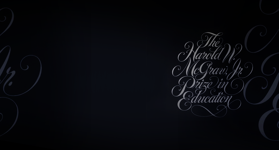
The Harold W. McGraw Hill Prize in Education Award

The Challenge
The Harold W. McGraw Hill
Prize in Education Award,
“The Nobel Prize in Education”
Design a distinguished typographic style logotype to establish the identity for the prestigious Harold W. McGraw Hill Prize in Education Award.
The Harold W. McGraw, Jr. Prize in Education recognizes innovators who unleash human potential through technology, methodology, and leadership.
The Harold W. McGraw, Jr. Prize in Education is awarded annually by the Harold W. McGraw, Jr. Family Foundation and University of Pennsylvania Graduate School of Education.
The prize was established in 1988 by the Board of Directors of McGraw-Hill to honor Harold W. McGraw, Jr., the company's Chair and CEO, and his commitment to education and literacy.
Brand Identity Messaging is Always On™

An Iconic Typographic Logotype for a World Class Award Presentation
Logo design is a complex form of engineering. Graphic Designers are capable of aligning sight, sound, color, texture, light and forms into a highly distilled and powerful communication symbol.
A logo transmits the entire essence of the a brand story and evokes emotion in a single glance. An iconic logo has a timeless intrinsic feel and is instantly recognizable. It is a treasure trove of high value for any brand property as it occupies hearts and minds while evoking positive emotions and love.
An Iconic Brand Identity Design has Many Possibilities
Knowing the one solution that works best requires going through a process of discovering what doesn’t work.


Design is Discovery
Form Follows Function
Fun with Purpose
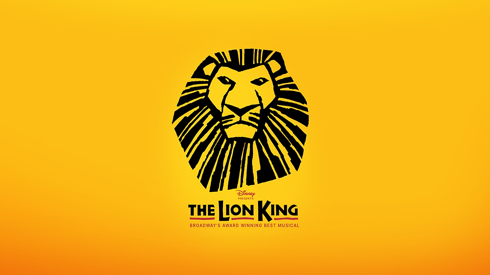
The initial iterations of “The Lion King - Broadway Show” logo design were all drawn by hand before being re-drawn digitally. Disney provided a handful of press-released photographs of Julie Taymour's sketches, and the costumes and masks under construction on Broadway for reference.
Masks were carved out of clay, there were sunset-warm earthy colors, a plethora of natural grasses, feathers and textures combined with vibrant African bogolanfini mud cloth patterns.
Creating an iconic symbol with timeless appeal requires a highly intuitive design process of immersion and focus. We visited Santa Monica bookstores to pull accurate African pattern references, and actual African made mud cloth and bead designs. Each reference displayed bold, primitive forms with uneven lines in their design, filled with textures and patterns; all evidence of being tooled by hand.
"I wanted to be surrounded by every essence of the show," said logo designer and art director, Mary Ellen Schrock. Every African tribal texture and graphic pattern we could find that resembled the photographs was tacked up on the walls."
Iconic masks and animal shapes were emerging as prominent forms from from all of the African graphic references It became evident that if the icon could resemble the Lion King mask it would resonate deeply and capture and convey the essence of the show.
FLOH CREATIVE - DISNEY THE LION KING BROADWAY BRAND IDENTITY
A Timeless Story Always On™

A brand identity with world-wide appeal for a story translated into 9 languages and incorporating 6 indigenous African languages in lyrics and dialogue.

FLOH CREATIVE - DISNEY THE LION KING BROADWAY BRAND IDENTITY
ICONIC
BOLD
EXPRESSIVE
MEMORABLE
Getting to the balanced icon design that captured the essence of the show "took many versions," says Mary Ellen. "We presented four rounds with hundreds of different versions and revisions. Disney typically explores every option to get to the undoubtable winner, the "one."
Another influencing factor in the logo creation was the show music. But the music from the show was still in production and unavailable as a recording. "I managed to find a copy of a CD, "The Rhythm of the Pridelands", said Mary Ellen, "which featured African singers performing acappella versions of songs in the musical."
One song in particular stood out as being very powerful, " 'He Lives In You'. When I heard the song acappella," she said, "the African voices were so other worldly and harmonic. It lifted me and gave me chills; absolutely sensational!
I was working on the Lion King face shape and expression. And reviewing the nuances of the form and expression with the music playing gave me a sense of this elevated feeling.
Moments like this signal the logo is resonating the core essence and the message of the story. It's alignment with the story's true meaning and purpose and a really powerful and pure aspect of design that I love."

Get in touch to learn about the Always On™ Brand Identities we’re creating for Warner Bros., Discovery, Coca-Cola, Disney and more

MARY ELLEN SCHROCK
